Explain Python Machine Learning Models with SHAP Library – Minimatech
(能翻墙直接看原文)
Explain Python Machine Learning Models with SHAP Library
- 11 September 2021
- Muhammad Fawi
- Machine Learning

Using SHapley Additive exPlainations (SHAP) Library to Explain Python ML Models
Almost always after developing an ML model, we find ourselves in a position where we need to explain this model. Even when the model is very good, it is still a black box that needs to be deciphered. Explaining a model is a very important step in a data science project that we usually overlook. SHAP library helps in explaining python machine learning models, even deep learning ones, so easy with intuitive visualizations. It also demonstrates feature importances and how each feature affects model output.
Here we are going to explore some of SHAP’s power in explaining a Logistic Regression model.
We will use the Bank Marketing dataset[1] to predict whether a customer will subscribe a term deposit.
Data Exploration
We will start by importing all necessary libraries and reading the data. We will use the smaller dataset in the bank-additional zip file.
import pandas as pd
import numpy as np
import matplotlib.pyplot as plt
import seaborn as sns
import shap
import zipfile
from sklearn.impute import SimpleImputer
from sklearn.preprocessing import OneHotEncoder, StandardScaler
from sklearn.pipeline import Pipeline
from sklearn.compose import ColumnTransformer
from sklearn.linear_model import LogisticRegression
from sklearn.model_selection import train_test_split
from sklearn.metrics import confusion_matrix, precision_recall_curve
from sklearn.metrics import accuracy_score, precision_score
from sklearn.metrics import recall_score, auc, roc_curve
zf = zipfile.ZipFile("bank-additional.zip")
df = pd.read_csv(zf.open("bank-additional/bank-additional.csv"), sep = ";")
df.shape
# (4119, 21)
Let’s look closely at the data and its structure. We will not go in depth in the exploratory data analysis step. However, we will see how data looks like and perform sum summary and descriptive stats.
df.isnull().sum().sum() # no NAs
# 0
## looking at numeric variables summary stats
df.describe()
Let’s have a quick look at how the object variables are distributed between the two classes; yes and no.
## counts
df.groupby("y").size()
# y
# no 3668
# yes 451
# dtype: int64
num_cols = list(df.select_dtypes(np.number).columns)
print(num_cols)
# ['age', 'duration', 'campaign', 'pdays', 'previous', 'emp.var.rate', 'cons.price.idx', 'cons.conf.idx', 'euribor3m', 'nr.employed']
obj_cols = list(df.select_dtypes(object).drop("y", axis = 1).columns)
print(obj_cols)
# ['job', 'marital', 'education', 'default', 'housing', 'loan', 'contact', 'month', 'day_of_week', 'poutcome']
df[obj_cols + ["y"]].groupby("y").agg(["nunique"])
# job marital education default housing loan contact month day_of_week poutcome
# nunique nunique nunique nunique nunique nunique nunique nunique nunique nunique
# y
# no 12 4 8 3 3 3 2 10 5 3
# yes 12 4 7 2 3 3 2 10 5 3
Seems like categorical variables are equally distributed between the classes.
I know that this is so quick analysis and shallow. But EDA is out of the scope of this blog.
Feature Preprocessing
Now it is time to prepare the features for the LR model. Scaling the numer variables and one hot encode the categorical ones. We will use ColumnTransformer to apply different preprocessors on different columns and wrap everything in a pipeline.
## change classes to float
df["y"] = np.where(df["y"] == "yes", 1., 0.)
## the pipeline
scaler = Pipeline(steps = [
## there are no NAs anyways
("imputer", SimpleImputer(strategy = "median")),
("scaler", StandardScaler())
])
encoder = Pipeline(steps = [
("imputer", SimpleImputer(strategy = "constant", fill_value = "missing")),
("onehot", OneHotEncoder(handle_unknown = "ignore")),
])
preprocessor = ColumnTransformer(
transformers = [
("num", scaler, num_cols),
("cat", encoder, obj_cols)
])
pipe = Pipeline(steps = [("preprocessor", preprocessor)])
Split data into train and test and fit the pipeline on train data and transform both train and test.
X_train, X_test, y_train, y_test = train_test_split(
df.drop("y", axis = 1), df.y,
stratify = df.y,
random_state = 13,
test_size = 0.25)
X_train = pipe.fit_transform(X_train)
X_test = pipe.transform(X_test)
Reverting to the exploratory phase. A good way to visualize one hot encoded data, sparse matrices with 1s and 0s, is by using imshow(). We will look at the last contact month columns which is now is converted into several columns with 1 in the month when the contact happened. The plot will also be split between yes and no.
First let’s get the new feature names from the pipeline.
## getting feature names from the pipeline
nums = pipe["preprocessor"].transformers_[0][2]
obj = list(pipe["preprocessor"].transformers_[1][1]["onehot"].get_feature_names(obj_cols))
fnames = nums + obj
len(fnames) ## new number of columns due to one hot encoder
# 62
Let’s now visualize!
from matplotlib.colors import ListedColormap
print([i for i in obj if "month" in i])
# ['month_apr', 'month_aug', 'month_dec', 'month_jul', 'month_jun', 'month_mar', 'month_may', 'month_nov', 'month_oct', 'month_sep']
## filter the train data on the month data
tr = X_train[:, [True if "month" in i else False for i in fnames]]
fig, (ax1, ax2) = plt.subplots(1, 2, figsize = (15,7))
fig.suptitle("Subscription per Contact Month", fontsize = 20)
cmapmine1 = ListedColormap(["w", "r"], N = 2)
cmapmine2 = ListedColormap(["w", "b"], N = 2)
ax1.imshow(tr[y_train == 0.0], cmap = cmapmine1, interpolation = "none", extent = [3, 6, 9, 12])
ax1.set_title("Not Subscribed")
ax2.imshow(tr[y_train == 1.0], cmap = cmapmine2, interpolation = "none", extent = [3, 6, 9, 12])
ax2.set_title("Subscribed")
plt.show()

Of course, we need to sort the columns with months order and put labels so that the plot can be more readable. But it is just to quickly visualize sparse matrices with 1s and 0s.
Model Development
Now it is time to develop the model and fit it.
clf = LogisticRegression(
solver = "newton-cg", max_iter = 50, C = .1, penalty = "l2"
)
clf.fit(X_train, y_train)
# LogisticRegression(C=0.1, max_iter=50, solver='newton-cg')
Now we will look at model’s AUC and set the threshold to predict the test data.
y_pred_proba = clf.predict_proba(X_test)[:, 1]
fpr, tpr, _ = roc_curve(y_test, y_pred_proba)
roc_auc = auc(fpr, tpr)
plt.plot(fpr, tpr, ls = "--", label = "LR AUC = %0.2f" % roc_auc)
plt.plot([0,1], [0,1], c = "r", label = "No Skill AUC = 0.5")
plt.legend(loc = "lower right")
plt.ylabel("true positive rate")
plt.xlabel("false positive rate")
plt.show()

The model shows a very good AUC. Let’s now set the threshold that gives the best combination between recall and precision.
precision, recall, threshold = precision_recall_curve(
y_test, y_pred_proba)
tst_prt = pd.DataFrame({
"threshold": threshold,
"recall": recall[1:],
"precision": precision[1:]
})
tst_prt_melted = pd.melt(tst_prt, id_vars = ["threshold"],
value_vars = ["recall", "precision"])
sns.lineplot(x = "threshold", y = "value",
hue = "variable", data = tst_prt_melted)

We can spot that 0.3 can be a very good threshold. Let’s test it on test data.
y_pred = np.zeros(len(y_test))
y_pred[y_pred_proba >= 0.3] = 1.
print("Accuracy: %.2f%%" % (100 * accuracy_score(y_test, y_pred)))
print("Precision: %.2f%%" % (100 * precision_score(y_test, y_pred)))
print("Recall: %.2f%%" % (100 * recall_score(y_test, y_pred)))
# Accuracy: 91.65%
# Precision: 61.54%
# Recall: 63.72%
Great! The model is performing good. Maybe it can be enhanced, but for now let’s go and try to explain how it behaves with SHAP.
Model Explanation and Feature Importance
Introducing SHAP
From SHAP’s documentation; SHAP (SHapley Additive exPlanations) is a game theoretic approach to explain the output of any machine learning model. It connects optimal credit allocation with local explanations using the classic Shapley values from game theory and their related extensions.
In brief, aside from the math behind, this is how it works. When we pass a model and a training dataset, a base value is calculated, which is the average model output over the training dataset. Then shap values are calculated for each feature per each example. Then each feature, with its shap values, contributes to push the model output from that base value to left and right. In a binary classification model, features that push the model output above the base value contribute to the positive class. While the features contributing to negative class will push towards below the base value.
Let’s have a look at how this looks like. First we define our explainer and calculate the shap values.
explainer = shap.Explainer(clf, X_train, feature_names = np.array(fnames))
shap_values = explainer(X_test)
Now let’s visualize how this works in an example.
Individual Visualization
## we init JS once in our session
shap.initjs()
ind = np.argmax(y_test == 0)
print("actual is:", y_test.values[ind], "while pred is:", y_pred[ind])
shap.plots.force(shap_values[ind])
# actual is: 0.0 while pred is: 0.0
![]()
We can see how the shown observations (scaled) of duration, number of employees, 3 month euribor and contact via telephone = 1 push the model below the base value (-3.03) resulting in a negative example. While last contact in June not May and 1.53 scaled consumer price index tried to push to the right but couldn’t beat the blue force.
We can also look at the same graph using waterfall graph representing cumulative sum and how the shap values are added together to give the model output from the base value.
shap.plots.waterfall(shap_values[ind])
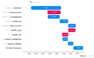
We can see the collision between the features pushing left and right until we have the output. The numbers on the left side is the actual observations in the data. While the numbers inside the graph are the shap values for each feature for this example.
Let’s look at a positive example using the same two graphs.
ind = np.argmax(y_test == 1)
print("actual is:", y_test.values[ind], "while pred is:", y_pred[ind])
shap.plots.force(shap_values[ind])
# actual is: 1.0 while pred is: 1.0
![]()
shap.plots.waterfall(shap_values[ind])
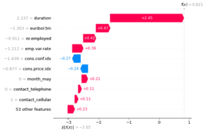
It is too obvious how values are contributing now to the positive class. We can see from the two examples that high duration contributes to positive class while low duration contributes to negative. Unlike number of employees. High nr_employed contributes to negative and low nr_employed contibutes to positive.
Collective Visualization
We saw how the force plot shows how features explain the model output. However, it is only for one observation. We now will look at the same force plot but for multiple observations at the same time.
shap.force_plot(explainer.expected_value, shap_values.values, X_test, feature_names = fnames)

This plot (interactive in the notebook) is the same as individual force plot. Just imagine multiple force plots rotated 90 degrees and added together for each example. A heatmap also can be viewed to see the effect of each feature on each example.
shap.plots.heatmap(shap_values)

The heatmap shows the shap value of each feature per each example in the data. Also, above the map, the model output per each example is shown. The small line plot going above and below the base line.
Another very useful graph is the beeswarm. It gives an overview of which features are most important for the model. It plots the shap values of every feature for every sample as the heatmap and sorts these features by the sum of its shap value magnitudes over all examples.
shap.plots.beeswarm(shap_values)

We can see that duration is the most important variable and high duration increases the probability for positive class, subscription in our example. While high number of employees decreases the probability for subscription.
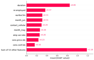
We can also get the mean of the absolute shap values for each feature and plot a bar chart.
shap.plots.bar(shap_values)
Fantastic! We have seen how SHAP can help in explaining our logistic regression model with very useful visualizations. The library can explain so many models including neural networks and the project github repo has so many notebook examples.